
Your quality management system contains an abundance of information. Collecting, analysing and reporting all this data is fairly easy with our forms and analytics features. Understanding the relations and the impact of change might be harder. That’s why we developed the Visualize feature.
Visualize helps you to connect the dots in your quality management. You’ll see your quality system like never before, opening a whole new realm of insights.
In this article
One minute intro
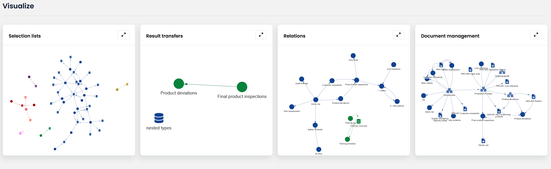
Network graphs
Visualize offers a series of network graphs that depict the relations between entities in your eQMS. This shows you the setup of your QMS, how analysis sets are interconnected via Set Relations and how result transfers send data across the application.
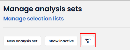
You can navigate to visualize via the Visualize icon. This icon can be found in the menu via Menu » Management » Visualize and from the Worklow management and analysis set management screens.
Interactive interface
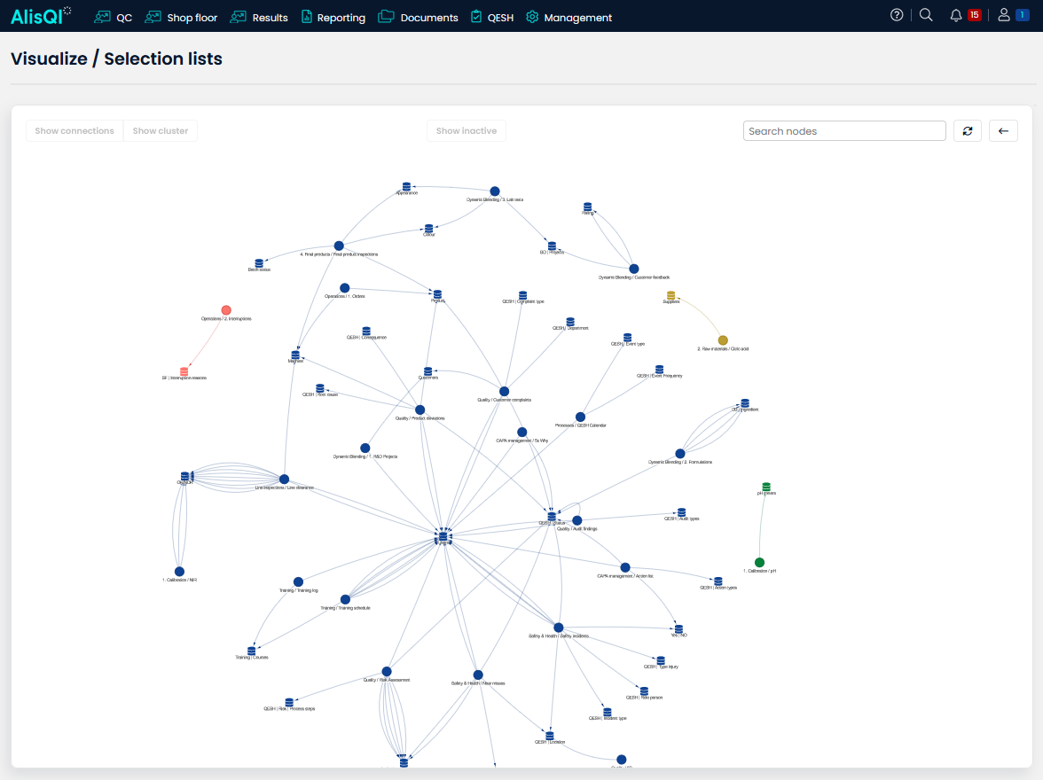
The user interface is highly interactive, allowing you to zoom, focus on clusters and search for individual analysis sets or selection lists.
Drag nodes across the screen to adjust the layout to your convenience.
Drag & zoom
Utilize the mouse scroll wheel or touchpad to zoom in and out. You can reposition nodes to tailor the graph to your preferences.
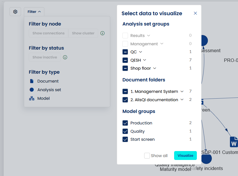
Filter
Use the settings and filter controls to define what you would like to visualize.
 Show cluster
A cluster is defined as all the nodes that are (in)directly linked to eachother. You can focus on an individual cluster by clicking the Toolbar » Show cluster button.
Show direct connections
Use the Toolbar » Show connection button to only show the direct connections for a particular set or selection list in your graph.
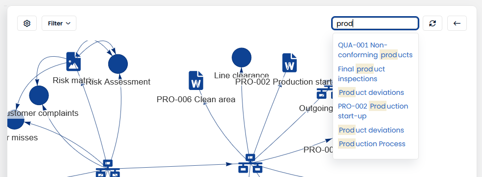
Search
Use the search box to quickly zoom in on particular nodes in the chart. The search scope includes all visible analysis sets, documents or models in the graph.
Halt stabilization
For larger data sets, the graph's stabilization may take some time. To manage this, a pause button is available that allows you to instantly freeze the graph, stopping the stabilization process. Need to make adjustments or continue? Just click the button again to resume the graph's stabilization. This feature ensures seamless interaction with all graph elements—eliminating any motion that might cause discomfort.
Click on a node or connection in the graph to see all their relevant properties and links.