Modern-day technology makes it very easy to generate a lot of data. Once you imported your data into AlisQI, the magic begins. The smart QMS comes with integrated charting and statistical tools that make trends visible and allow you to learn from your data.
In this article
Charting
AlisQI offers a number of charting tools. All data inputted in analysis sets can be reported by means of these charts. The exact types of charts that are available for a particular field depend on the field type. The charts are available for all data, either inputted manually, acquired automatically, or calculated.
- Control chart
Available for all numeric fields. Represents a run chart of all measurement values, including the control limits and specifications. If you deploy an SPC ruleset, these are available in the control charts as well. - SPC overview
The SPC overview contains a collection of charts, including a histogram, control chart, and range chart. Furthermore, the panel contains a set of descriptive statistics, including capability indicators. This overview is available for all numeric fields. - Distribution
For all selection lists fields, there are Pie and Pareto charts available to analyze the distribution of the data. Click on a select field's column header to open the distribution panel.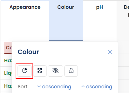
Storing charts
Charts can be stored, in order to quickly open them whenever needed.
Stored charts are available for every user with read permission to the underlying analysis set.
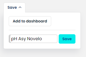
Saved graphs can be found under Reporting » Graphs
Statistics overview
Filter data sets
You will often find yourself analyzing subsets of data instead of the full firehose of data. Analyzing subsets of data can be done by first filtering your data, before opening the charts or statistics. The filter is applied in the results overview. With the great flexibility of the filters, you can focus your data set as much as you want.
Dashboards
All charts can be included in dashboards in order to summarize or bundle relevant data. You can create as many dashboards with as many panels as you need.