The X-bar and R-chart are always created and shown as a pair. They are used to monitor variable data from samples collected at regular intervals. The sample size for the X-bar and R-chart should be between 2 and 10. If the sample size exceeds 10, the R-chart is replaced by an S chart.
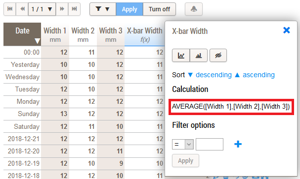
The first thing you need to do is to add a calculated field for the X-bar, representing the average of the data entry fields.
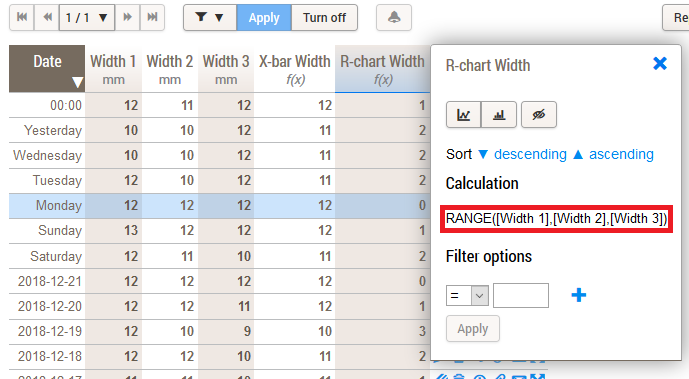
After that you need to add another calculated field, this time for the R-chart. This field needs to represent the range of the data entry fields.
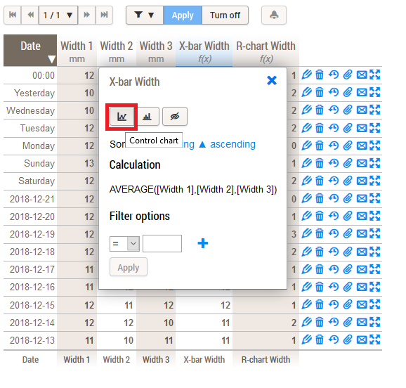
When this is done, simply click on the X-bar or R-chart column header and click on Control chart.
A new window will pop up. Click on Toolbar » Display » Show control limits » Yes and next on Update. The control limits will now be visible on your chart.
